Website Pages:

Welcome to Pipeline Design Patterns
Vocabulary
A Theory of Pipeline
General Thoughts on Pipeline
The Map Metaphor
Patterns as Shapes
Pipeline Design Patterns
Case Studies

Sections in this Page:

The Map Metaphor
Map Axes as Verbs
Map Axes as Nouns
Nouns vs Verbs
London Tube Map

Definitions:

A Vocabulary for Diagrams
Glossary

The Map Metaphor

In this book, pipeline diagrams have a very specific visual structure, based on a map metaphor.

At first glance the diagrams are just standard node graphs. These are very common in the graphics industry, for compositing, scene definition, rigging and shading definition, even for pipelines.

But let's face it, most graphs are unreadable. To be fair: if you are the original author and the graph is recent, simple enough, and carefully organized, then maybe you can read it. Otherwise the typical node graph is a spaghetti tangle.

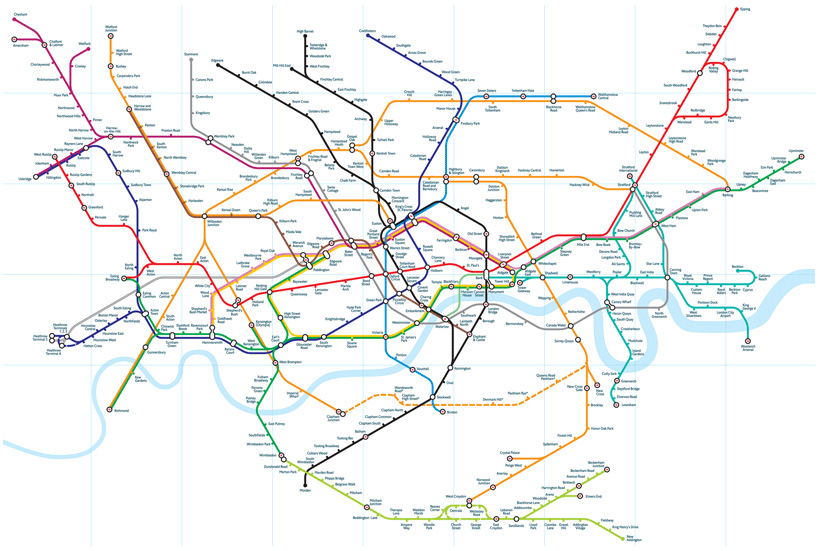
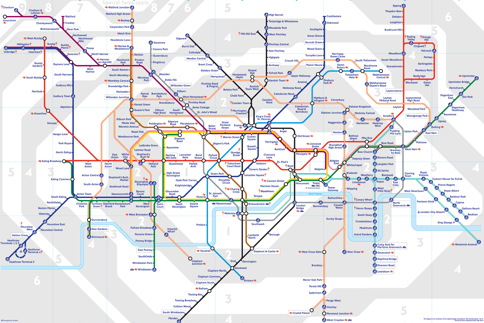
And yet we all read maps that are just as complex. We reason about them, make decisions as to best route, etc. Maps work so well because they follow a spatial metaphor: features are placed by lattitude, longitude, and scale. So, for example, on a map of California, San Francisco is above Los Angeles. (And map software doesn't let you drag Los Angeles around, with all the highways reconfiguring themselves like rubber bands.)

So that is the key insight: node graphs by themselves are not good tools for reasoning about complex systems. Something else is needed — a spatial metaphor.

There are many other spatial metaphors in our everyday two-dimensional communication.

  • text: left to right and top to bottom, indicating time.

  • source code: vertical axis is execution order, horizontal spacing indicates scope.

  • directory listings: indentation indicates grouping.

  • bar charts, function plots, etc.: obey specific rules as to the meaning of axes.

Map Axes as Verbs

Pipelines do two big things for us in digital production. First, they manage the conversion of data formats, and second, they manage the synchronization of data sets across infrastructure levels. Examples of the latter include Perforce syncing and cloud rendering.

It's very natural to draw conversion on the horizontal axis. In whiteboard sessions we invariably draw conversions as data flowing left to right through through processes.

horiz_axis
Click on diagram to Zoom/Unzoom.

It's also natural to draw synchronization on the vertical axis. In whiteboard sessions we invariably draw global datastores and cloud services at the top of the board, and local stuff below.

vert_axis
Click on diagram to Zoom/Unzoom.

Here's a typical map using these axes:

intro_big_pipeline
Click on diagram to Zoom/Unzoom.

Map Axes as Nouns

Another way to approach this: We can think of a pipeline as a big version management system, where the versions come in three types:

Representation— i.e. Maya vs Alembic vs RIB vs EXR etc. This is the same (conceptual) data, encoded different ways for different consumers. i.e. it's the same CoffeeCup, just re-encoded from stage to stage. Note this concept maps directly onto the conversion role that pipelines fulfill.

Revision— i.e. first checkin vs second checkin etc. Note this concept maps directly onto the synchronization role.

Variation— i.e. red vs blue, pine vs oak, etc. Note this is the domain of our artists.


Often we speak carelessly, using just one term, version, to mean all three: “I just checked in the 3rd version of the CoffeeCup. It's the Alembic version. It's the red version.”

But if we speak precisely we get a much clearer sentence: “I just checked in the 3rd revision of the Alembic representation of the red variation of the CoffeeCup.”

As pipeline designers, we should build systems that handle representation and revision, and allow artists to focus on variation. In other words, they should not need to know about Alembic or Perforce.

Nouns vs Verbs

The two concepts above are related. One definition of axis is: one quantity is fixed as another varies.

Horizontal axis — Data is being converted. The revision level is fixed but the representation is varying.

Vertical axis — Data is being synchronized. The representation is fixed but the revision level is varying.


Thus these aspects form the space in which we work. Our diagrams provide maps of that space, and representation and revision—or equivalently, conversion and synchronization—are our map axes.

London Tube Map

Here is an interesting analogy, due to Dave Levy of The Mill.

Our pipelines maps are not quite so literal as a typical geographical map. Perhaps a better comparison is to the famous London Tube Map.

Geographically Accurate Map

resources/images/geog_tube_map.jpg

“Tube Map”

resources/images/tube_map.gif

The Tube Map simplifies geographical information in favor of logical information such as:

  • what are the subway lines?

  • do they primarily go N, S, E, or W?

  • are they N or S of the Thames? (in fact, note how the Thames is simplified).

  • what is the logical order of stations along the each line?

  • where do the lines intersect (transfer stations)?

  • what are the fare zones? (the grey and white areas)

The spatial metaphor is based on a highly simplified notion of N, S, E, W.


From the Tube Map wiki page:

The first diagrammatic map of London's rapid transit network was designed by Harry Beck in 1931. Beck was a London Underground employee who realised that because the railway ran mostly underground, the physical locations of the stations were largely irrelevant ... only the topology of the route mattered.

To this end, Beck devised a simplified map, consisting of stations, straight line segments connecting them, and the River Thames; lines ran only vertically, horizontally, or on 45-degree diagonals.

This map has been the inspiration for almost all subsequent transit maps throughout the world.